New Name
Aruba's network assurance solution has a new name: User Experience Insight. Also, as part of our ongoing effort to make our products both simpler and smarter, we've made many improvements to the user interface, plus added several new features.
Let's start with the name. The three words may not roll off your tongue quickly, but they say a lot. User Experience Insight is more than a product name, it's also an increasingly essential methodology for understanding and managing the availability and performance of networks. It's the only way for you to efficiently know if your end users can satisfactorily connect to and use data, applications, and services inside and outside of your network.
KISS
An adage often used in technology is Keep It Super Simple (KISS). When it comes to managing networks, especially complex networks, Keep It Simple and Smart is apropos. That's what the User Experience Insight team has done with its uniquely simple intuitive dashboard. With this new release even more status and insights are available at-a-glance.
Let's dive deeper into what's new.
More At-A-Glance Insights
At first it may seem that information has been taken away because the traffic light status indicators have been reduced by one from five to four. You actually now receive more information because the Wi-Fi and Network information have been combined into a single status group. Icons to the right of each sensor convey whether any issue detected is due to a power failure, or if it is with the wired network, the wireless network, or both.
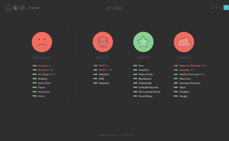
Figure 1: Top-level status is now conveyed in four categories, each with its own “traffic light” status indicator
![]()
A small strip, which we call a "status strip," is displayed to left of each sensor or sensor group, and each test. The strips show the proportion of sensors that are affected by an issue, enabling you to quickly identify and prioritize the most severe issues for resolution.
Figure 3: Status strips reveal the severity of issues
Grouping and Filtering Facilitates Focus and Efficiency
To help you manage infrastructure, time, and priorities you can create hierarchical groups of sensors nested to seven levels. As an example, if your organization is distributed, you could group sensors by region, campus, building, and floor. The dashboard has a new an interactive “breadcrumb” indicator that shows how many levels deep you are in the hierarchy; it also lets you jump directly to any sensor group.
Automatic issue grouping helps you focus so you can efficiently find and fix problems by reducing visual clutter and alert fatigue. Issue grouping lets you readily identify that a malfunction with common network services such as authentication, DHCP, or DNS is the root cause errors from multiple sensors and tests.
For More Information, See the Release Notes
Several other new features plus under-the-hood improvements are in this update. The full details are provided in the release notes. View more details about the User Experience Insight May 2019 Update.