This blog post is going to give the basics on terminology and different graphs used in spectrum analysis. Obviously I am aware that some of you are well passed this point and are masters with you spectrum analysis tool of choice. If that is the case simply hang tight and maybe I can give you a tidbit of info. If you are still in your journey of becoming a wireless expert, then I have a treat of invaluable knowledge for you.
I remember back a few years ago when I started on my wireless journey. Someone was teaching me how to capture spectrum data using Airmagnet Spectrum XT. I was overwhelmed and did not care what all the graphs meant. I followed my procedure and captured data like I was told. I believe other have and do the same. I challenge you to learn the many aspects of spectrum analysis and use the knowledge to better your work.
Spectrum analysis can be used to find RF interferes in your RF domain. It can also be used for device testing. If a device say it uses a certain channel width in a certain frequency range, you can make sure using spectrum analysis.
When performing spectrum analysis I think of the spectrum analysis client antenna as a client and how see or is affected by the things in the spectrum. What you are seeing in the spectrum analyzer screen is that antenna's perspective of the environment in the EXACT SPOT. I never recommend walking around during a spectrum analysis unless you are trying to locate a device.
FFT
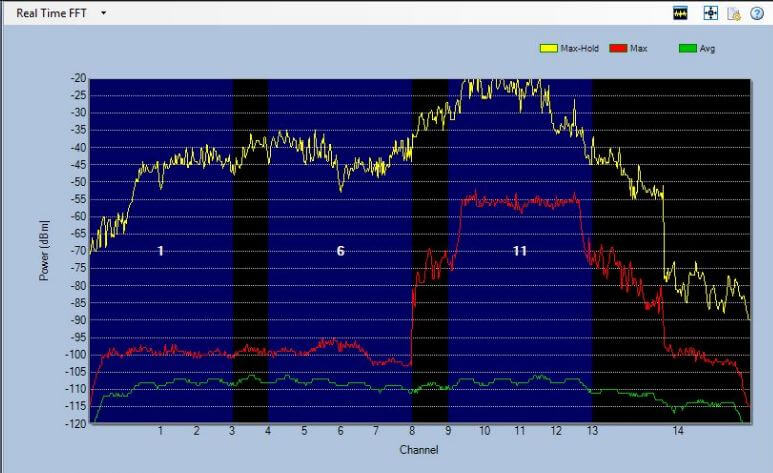
Within the FFT Plot we can analyze the amplitude of RF signal within a specified frequency range. On this graph, Power in dBm is displayed vertically while frequency is display horizontally. This graph is great for for looking at the overall spectrum and what might be in the environment. I like to enable max hold that way if I miss something that is quick, the max hold saves the outline.
Duty Cycle
The duty ccycle plot is one of my favorite and most important graphs. This graph displays utilization time vertically and frequency horizontally. This graph can tell you how active a device is. A device could be really loud and not really affect the channel. If a device has a high duty cycle and is within 20 dB of the wireless access point, this will cause problems.
Waterfall
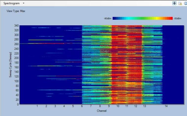
The waterfall or spectrogram is also a useful plot. The graph displays time vertically and frequency horizontally. The graph also has a "3rd dimension" in dBms. It allows you to see amplitude over time. It is useful when looking for a device that only shows up every once in a while.
Spectrum density
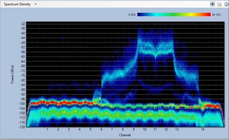
Spectrum density is also a 3 dimensional graph. Similar to the FFT plot. Power in dBm is displayed vertically while frequency is display horizontally. It also is kind of mixed with duty cycle in that is shows the percentage of density by displaying different colors. This graph can give you an outline of the most active portions of the frequencies in question. Remember to stay still or this graph will look like crap.
SNR
Signal to Noise is usually described between the power of a device and the noise floor. I also use is term to describe the difference between the power of two devices. So the SNR of an AP at -60 dBm and another AP at -80 dBm is 20 dB. Remember that when telling the difference between two devices to us dB(s) and not dBm(s).
When doing device testing, it is imperative to have a clean environment to be able to determine what noises are actually coming from the device being questioned. Most companies use a faraday cadge to obtain this clean environment. Or if you live out in the sticks like I do, you just simply turn off your wireless and you get an environment like this:
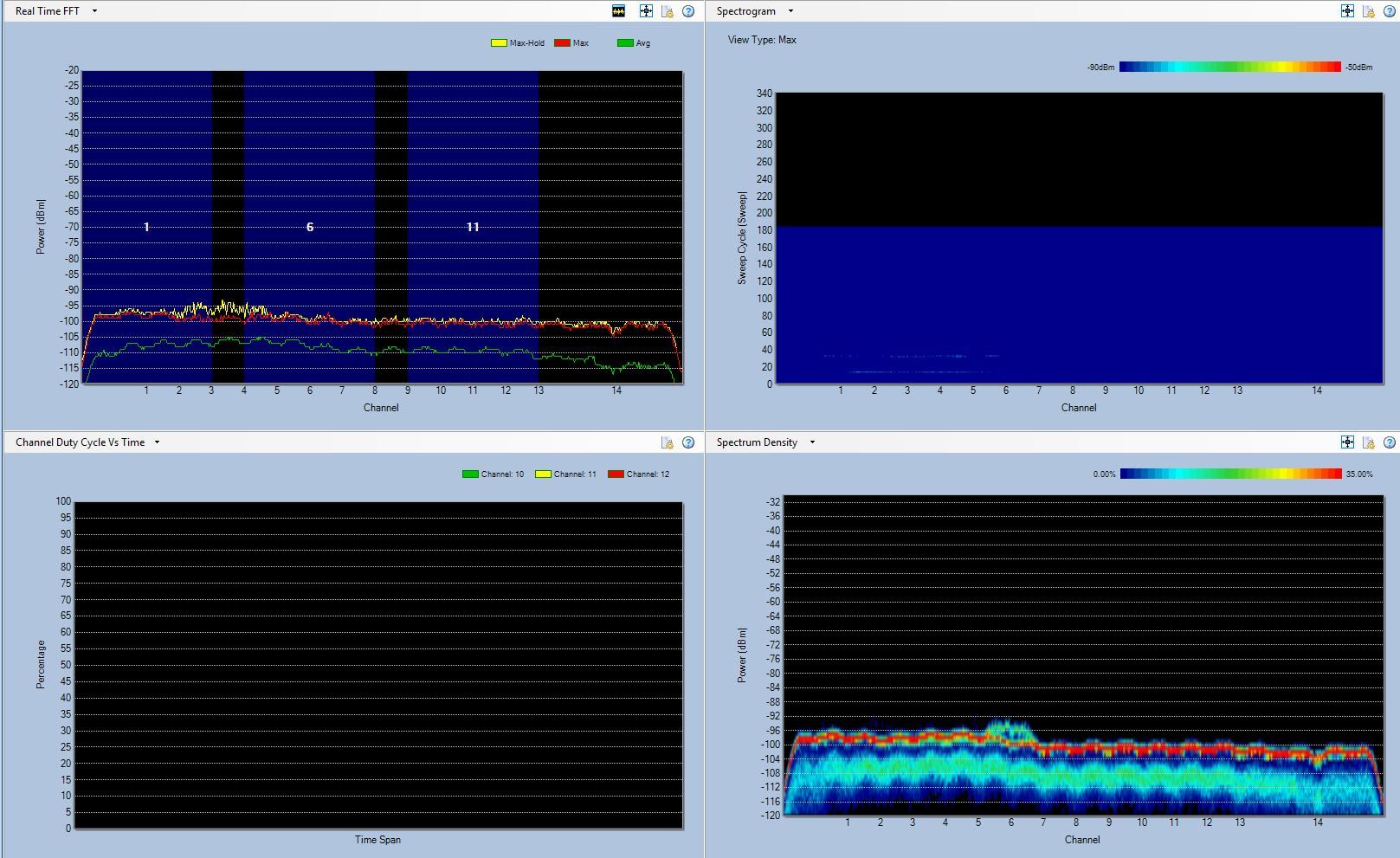
Remember that two of the most important things to look at are duty cycle and power.
This is only a brief overview of spectrum analysis. You can learn a tons more by picking up the CWAP book from CWNP.
